Contrast
The flower contrasts with the faded monotone background because the flower is so bright; it stands out.
Emphasis
The white background emphasizes the red puzzle piece because the redness makes its stand out and become the center of attention
Proportion/Scale
This picture uses proportion/scale by making the bike much larger than the rest of the objects in the picture
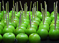
Repetition
This picture utilizes repetition by repeating similar objects numerous times
Rhythm
This picture shows rhythm in the waves because it uses a uniform line style
Variety
This picture shows variety because it has lots of different shapes, sizes, and colors.

Balance
This picture shows balance because it is evenly distributed on each side.

Unity
This pictures shows unity because all of the men are placed individually but in a way that appear to be one.
Also, answer the following questions in your own words.
How do you add a layer mask to a particular layer?
Add a new layer then connect the existing on with that one with the paperclip tool
Describe the process of using a layer mask?
A layer mask allows you to edit the picture on top and delete certain areas so that the layer attached to it shows up in the background


No comments:
Post a Comment