Friday, December 16, 2011
Semester Reflection
Throughout this semester, I have learned so many thing I never thought I would be able to do. For example, we learned how to blend ourselves into another picture. This was by far one of my favorite projects just because it was so cool yet so simple. I also really enjoyed the Stephen Kroninger assignment. I had seen his work before, but I never really knew how he created his designs. This class has taught me so many interesting things about type, images, and design. I now have a better understanding of why advertisements and designs are created the way they are. We often have to make posters or signs for classes, so I think I will be able to create a more efficient and interesting design with the techniques we have learned this year.

Review Week 17
Have you learned something?
-Yes. I learned where the word 'serif' actually came from. It can be traced back to ancient Rome. The actual serifs on the letters come from the little strokes at the end of painting a line or carving in rock. I also learned that there are two kinds of serifs. One being the Adnate serif because it is more organic and the second being abrupt because it is more squarer and rigid.
-Yes. I learned where the word 'serif' actually came from. It can be traced back to ancient Rome. The actual serifs on the letters come from the little strokes at the end of painting a line or carving in rock. I also learned that there are two kinds of serifs. One being the Adnate serif because it is more organic and the second being abrupt because it is more squarer and rigid.
Friday, December 2, 2011
Review Week 16
How many points are in an inch? How many points are in a pica?
72 points in an inch. 12 points in a pica.
Of the seven classifications, which classification(s) would best work as body type? Why?
Modern
Identify the lowercase characters that have ascenders?
bdfhiklt
Identify the lowercase characters that have descenders?
gjpqy
Classify the following typefaces and briefly explain why you believe it should be classified that way:

I know this is typed in Slab Serif because all the lines and curves are the same weight and thickness and also because the serifs are squared.

This was typed in Script because it resembles handwriting with the connected letters and flexible, smooth lines.

This is decorative because it too busy to be written for the whole body but it grabs the attention of the readers by being used as a headline or title

This is Sans Serif because all of the letters are exactly uniform and same weight. There are no serifs and all the letters have a monotone look.

This is Blackletter because the letters have different weights and resemble caligraphy. It is a type of decorative typeface because of the elaborate strokes.

This is Roman Style because the letters have a small variation of thick and thin strokes with wedged serifs.
72 points in an inch. 12 points in a pica.
Of the seven classifications, which classification(s) would best work as body type? Why?
Modern
Identify the lowercase characters that have ascenders?
bdfhiklt
Identify the lowercase characters that have descenders?
gjpqy
Classify the following typefaces and briefly explain why you believe it should be classified that way:
I know this is typed in Slab Serif because all the lines and curves are the same weight and thickness and also because the serifs are squared.
This was typed in Script because it resembles handwriting with the connected letters and flexible, smooth lines.
This is decorative because it too busy to be written for the whole body but it grabs the attention of the readers by being used as a headline or title
This is Sans Serif because all of the letters are exactly uniform and same weight. There are no serifs and all the letters have a monotone look.
This is Blackletter because the letters have different weights and resemble caligraphy. It is a type of decorative typeface because of the elaborate strokes.
This is Roman Style because the letters have a small variation of thick and thin strokes with wedged serifs.
Tuesday, November 29, 2011
Podcast #4 Typography
Define typography?
The art of expressing ideas through the selection of appropriate typefaces
Where did the word "typography" originate from?
"Typo" comes from the greek word meaning writing, "graphy" meaning form
What does typography involve?
Creating and modifying type using a variety of illustration techniques
What is a typeface?
Distinctive designs of visual symbols that are used to compose a printed image/design
What is another term for typeface?
Fonts
What is a character?
Individual symbols that make up a typeface (letters, numerals and punctuation)
What is type style?
Modifications in a typeface that create design variety while maintaining the visual style of the typeface (bold, italic, condensed, roman, heavy)
What does type style "create" within a design?
Creates interest and variety, but still keeping a uniform look
What is the waist line and what does it indicate?
Imaginary line drawn at the middle of characters
What is a base line and what does it indicate?
Imaginary line drawn at the bottom of the characters
What is an ascender?
The part of the character that extends above the waist line
What is a descender?
The part of the character that extends below the base line
Describe a serif?
Smaller line used to finish off a main stroke of a letter, usually at the top and bottom of a character
How can the size of the typeface be identified?
Point size from the top to the bottom of the letter.
What is a point?
A subdivision of a pica
How many points are in an inch?
72
What is a pica and how many are in an inch?
6
How many points are in a pica?
12
What is body type and where can it be found?
Type sizes that range from 4 pt through 12 pt type. These sizes are found in places where there is a lot of text to be read
What is the key to selecting appropriate typefaces to be used as body type?
Readability
What is display type and how is it used?
Type sizes above 12 pt. Typically, these sizes are used to draw attention to a message (headlines, subheadlines, etc)
What is reverse type and when would it be used?
Consists of white type on a solid black darker color background. If the text is too small, reverse type can be difficult on the reader's eye. Display type is necessary.
What is a typeface classification?
A basic system for classifying typefaces was devised in the 19th century when printers sought
to identify a heritage for their own craft.
When was Blackletter invented and how was it used?
It is the earliest of the typefaces. It was used with the inventions of the printing press in the mid 1400s. Most often seen in official documents such as diplomas, certificates, formal invitations, etc.
Describer the characteristics of a Blackletter typeface?
Resembles the calligraphy of the time and are highly ornamental with elaborate thick to thin strokes.
When was Old Style invented and what was is based on?
In the mid 1400s and was based on ancient Roman inscriptions and created to replace Blackletter typefaces
Describe the characteristics of an Old Style typeface?
Wedge-shaped, angled serifs and a low contrast of their thick/thin strokes.
When were formal scripts developed?
From the formal writings of 17th and 18th century handwriting masters. They will lend a formal quality to a composition
When were casual scripts developed?
In the 20th century
Describe the characteristics of a Script typeface?
Script typefaces are based on forms made with flexible brushes or pens and have varied strokes reminiscent of handwriting.
When was Modern typefaces developed and why?
In the late 18th and 19th centuries as radical break from traditional typography of the time.
Describe the characteristics of a Modern typeface?
Modern typefaces have a sharp contrast between thick and thin strokes and have thin. flat serifs.
How early can Sans Serif typefaces be found? What happened?
As early as the 5th century. However, the Italian Renaissance return to Old Stye made the Sans Serif classification obsolete in the 20th century.
When did they become popular?
1920s
What does "sans serif" mean?
"without Serif"
Describe the characteristics of a Sans Serif typeface?
Uniform in white and have a monotone stroke
When was Slab Serif developed and why?
19th century for advertising purposes
Describe the characteristics of a Slab Serif typeface?
It has a uniform line weight and thicker, square serifs.
Describe Decorative typefaces?
These typefaces have the most distinctive design style
Why were they developed?They were developed with a specific purpose, or theme, in mind.
What are they best used for?
Best used for larger point sizes, or display type
The art of expressing ideas through the selection of appropriate typefaces
Where did the word "typography" originate from?
"Typo" comes from the greek word meaning writing, "graphy" meaning form
What does typography involve?
Creating and modifying type using a variety of illustration techniques
What is a typeface?
Distinctive designs of visual symbols that are used to compose a printed image/design
What is another term for typeface?
Fonts
What is a character?
Individual symbols that make up a typeface (letters, numerals and punctuation)
What is type style?
Modifications in a typeface that create design variety while maintaining the visual style of the typeface (bold, italic, condensed, roman, heavy)
What does type style "create" within a design?
Creates interest and variety, but still keeping a uniform look
What is the waist line and what does it indicate?
Imaginary line drawn at the middle of characters
What is a base line and what does it indicate?
Imaginary line drawn at the bottom of the characters
What is an ascender?
The part of the character that extends above the waist line
What is a descender?
The part of the character that extends below the base line
Describe a serif?
Smaller line used to finish off a main stroke of a letter, usually at the top and bottom of a character
How can the size of the typeface be identified?
Point size from the top to the bottom of the letter.
What is a point?
A subdivision of a pica
How many points are in an inch?
72
What is a pica and how many are in an inch?
6
How many points are in a pica?
12
What is body type and where can it be found?
Type sizes that range from 4 pt through 12 pt type. These sizes are found in places where there is a lot of text to be read
What is the key to selecting appropriate typefaces to be used as body type?
Readability
What is display type and how is it used?
Type sizes above 12 pt. Typically, these sizes are used to draw attention to a message (headlines, subheadlines, etc)
What is reverse type and when would it be used?
Consists of white type on a solid black darker color background. If the text is too small, reverse type can be difficult on the reader's eye. Display type is necessary.
What is a typeface classification?
A basic system for classifying typefaces was devised in the 19th century when printers sought
to identify a heritage for their own craft.
When was Blackletter invented and how was it used?
It is the earliest of the typefaces. It was used with the inventions of the printing press in the mid 1400s. Most often seen in official documents such as diplomas, certificates, formal invitations, etc.
Describer the characteristics of a Blackletter typeface?
Resembles the calligraphy of the time and are highly ornamental with elaborate thick to thin strokes.
When was Old Style invented and what was is based on?
In the mid 1400s and was based on ancient Roman inscriptions and created to replace Blackletter typefaces
Describe the characteristics of an Old Style typeface?
Wedge-shaped, angled serifs and a low contrast of their thick/thin strokes.
When were formal scripts developed?
From the formal writings of 17th and 18th century handwriting masters. They will lend a formal quality to a composition
When were casual scripts developed?
In the 20th century
Describe the characteristics of a Script typeface?
Script typefaces are based on forms made with flexible brushes or pens and have varied strokes reminiscent of handwriting.
When was Modern typefaces developed and why?
In the late 18th and 19th centuries as radical break from traditional typography of the time.
Describe the characteristics of a Modern typeface?
Modern typefaces have a sharp contrast between thick and thin strokes and have thin. flat serifs.
How early can Sans Serif typefaces be found? What happened?
As early as the 5th century. However, the Italian Renaissance return to Old Stye made the Sans Serif classification obsolete in the 20th century.
When did they become popular?
1920s
What does "sans serif" mean?
"without Serif"
Describe the characteristics of a Sans Serif typeface?
Uniform in white and have a monotone stroke
When was Slab Serif developed and why?
19th century for advertising purposes
Describe the characteristics of a Slab Serif typeface?
It has a uniform line weight and thicker, square serifs.
Describe Decorative typefaces?
These typefaces have the most distinctive design style
Why were they developed?They were developed with a specific purpose, or theme, in mind.
What are they best used for?
Best used for larger point sizes, or display type
Monday, November 28, 2011
Review Week 14
Identify 5 colleges that offer graphic design (or related) majors. For each, list the school name, location, graphics majors that are offered, requirements for admission.
Name:
California College of Art & Design
Location:
California
Graphic Majors Offered:
Corporate Communications Design
Admission: Portfolio submitted electronically or by CD/DVD.
Name:
University of the Arts
Name:
Ringling College of Art & Design
Location:
Florida's gulf coast.
Graphic Majors Offered:
Corporate Communications Design
Name:
College of Art & Design
Location:
Minneapolis
Answer the following questions in your own words... What is a portfolio?A set of pieces of creative work collected by someone to display their skills, esp. to a potential employer.
What is the importance of a portfolio?
It allows potential employers and schools look at your work and gives them proof of your skills and abilities.
Name:
California College of Art & Design
Location:
California
Graphic Majors Offered:
Corporate Communications Design
Creative Services Manager
Exhibition Design
Freelance Graphic Design
Name:
University of the Arts
Graphic Majors Offered:
Exhibition Design
Exhibition Design
Freelance Graphic Design
Marketing and Promotion Design
Motion Graphics Design for Television
Packaging and Point-of-Purchase Design
Publication and Print Media Design
Admission: Application checklist and portfolio.
Name:
Ringling College of Art & Design
Location:
Florida's gulf coast.
Graphic Majors Offered:
Corporate Communications Design
Creative Services Manager
Exhibition Design
Freelance Graphic Design
Marketing and Promotion Design
Motion Graphics Design for Television
Packaging and Point-of-Purchase Design
Publication and Print Media Design
Retail Graphics Design
Web Design
Admission:
GED portfolio, high GPA and standardized test scores.
Name:
College of Art & Design
Location:
Minneapolis
Graphic Majors Offered:
Packaging and Point-of-Purchase Design
Packaging and Point-of-Purchase Design
Publication and Print Media Design
Retail Graphics Design
Web Design
Admission:
Application checklist and portfolio.
Name:
West Virginia University
Location:
Location:
West Virginia
Graphic Majors Offered:
Exhibition Design
Admission:
Graphic Majors Offered:
Exhibition Design
Freelance Graphic Design
Marketing and Promotion Design
Motion Graphics Design for Television
Application checklist and portfolio.
Answer the following questions in your own words... What is a portfolio?A set of pieces of creative work collected by someone to display their skills, esp. to a potential employer.
What is the importance of a portfolio?
It allows potential employers and schools look at your work and gives them proof of your skills and abilities.
Review Week 13
For each of the 8 principles of design, find an example that utilizes the principle within the design. You should have 8 DIFFERENT sample designs. For each, discuss how the particular principle is used.

Contrast
The flower contrasts with the faded monotone background because the flower is so bright; it stands out.

Emphasis
The white background emphasizes the red puzzle piece because the redness makes its stand out and become the center of attention

Proportion/Scale
This picture uses proportion/scale by making the bike much larger than the rest of the objects in the picture
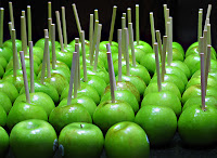
Repetition
This picture utilizes repetition by repeating similar objects numerous times

Rhythm
This picture shows rhythm in the waves because it uses a uniform line style

Variety
This picture shows variety because it has lots of different shapes, sizes, and colors.

Balance
This picture shows balance because it is evenly distributed on each side.

Unity
This pictures shows unity because all of the men are placed individually but in a way that appear to be one.
Also, answer the following questions in your own words.
How do you add a layer mask to a particular layer?
Add a new layer then connect the existing on with that one with the paperclip tool
Describe the process of using a layer mask?
A layer mask allows you to edit the picture on top and delete certain areas so that the layer attached to it shows up in the background

Contrast
The flower contrasts with the faded monotone background because the flower is so bright; it stands out.

Emphasis
The white background emphasizes the red puzzle piece because the redness makes its stand out and become the center of attention

Proportion/Scale
This picture uses proportion/scale by making the bike much larger than the rest of the objects in the picture

Repetition
This picture utilizes repetition by repeating similar objects numerous times

Rhythm
This picture shows rhythm in the waves because it uses a uniform line style

Variety
This picture shows variety because it has lots of different shapes, sizes, and colors.

Balance
This picture shows balance because it is evenly distributed on each side.

Unity
This pictures shows unity because all of the men are placed individually but in a way that appear to be one.
Also, answer the following questions in your own words.
How do you add a layer mask to a particular layer?
Add a new layer then connect the existing on with that one with the paperclip tool
Describe the process of using a layer mask?
A layer mask allows you to edit the picture on top and delete certain areas so that the layer attached to it shows up in the background
Tuesday, November 8, 2011
Review Week 12
How can you, as the designer, use principles of design to help compose a page?
-The principles of design are basically like guidelines they help you design a page effectively so that it keeps the audiences attention
What are the principles of design?
Balance: making sure it's not too much or too little on one design
Proportion: The scale of one object to another
Rhythm: The pattern a design has
Emphasis: Making one element stand out more than the rest
Unity: Making sure not too much is going on in one composition
-The principles of design are basically like guidelines they help you design a page effectively so that it keeps the audiences attention
What are the principles of design?
Balance: making sure it's not too much or too little on one design
Proportion: The scale of one object to another
Rhythm: The pattern a design has
Emphasis: Making one element stand out more than the rest
Unity: Making sure not too much is going on in one composition
Subscribe to:
Posts (Atom)